Perspectives

Designing for surfaces that matter to people
Mike Chatfield, Cofounder of MIJO

Street level thinking + world class craft aren’t buzzwords. They hold us accountable.
We need to design things that people use every day. Things that mean a lot to them. That they hold close. In their pockets. In their homes. The thing they see when they walk into a bank to make a life changing financial decision.
In redesigning Carver Bank’s brand, we had to keep people at the center of every creative decision. That meant understanding what should change, what should stay, and where the work would actually live.
A familiar logo. A stronger presence.
We didn’t revolutionize the Carver logo. We made important tweaks to give it more consistency, strength, and clarity without losing its familiarity.
The wordmark was already on the outside of every branch, and replacing all that signage wasn’t in the budget. We stayed true typographically, making subtle refinements to improve readability and give it more confidence across applications.
The icon mattered, too. Through discovery, we learned that the interlocking C’s stood for Carver + Community. That meaning had been there for years, and the symbol held importance to people who had known the bank for decades.
Instead of introducing a new icon, we found bold, maximalist ways to celebrate the one they already had. Bigger. More visible. A familiar mark with a much stronger presence.

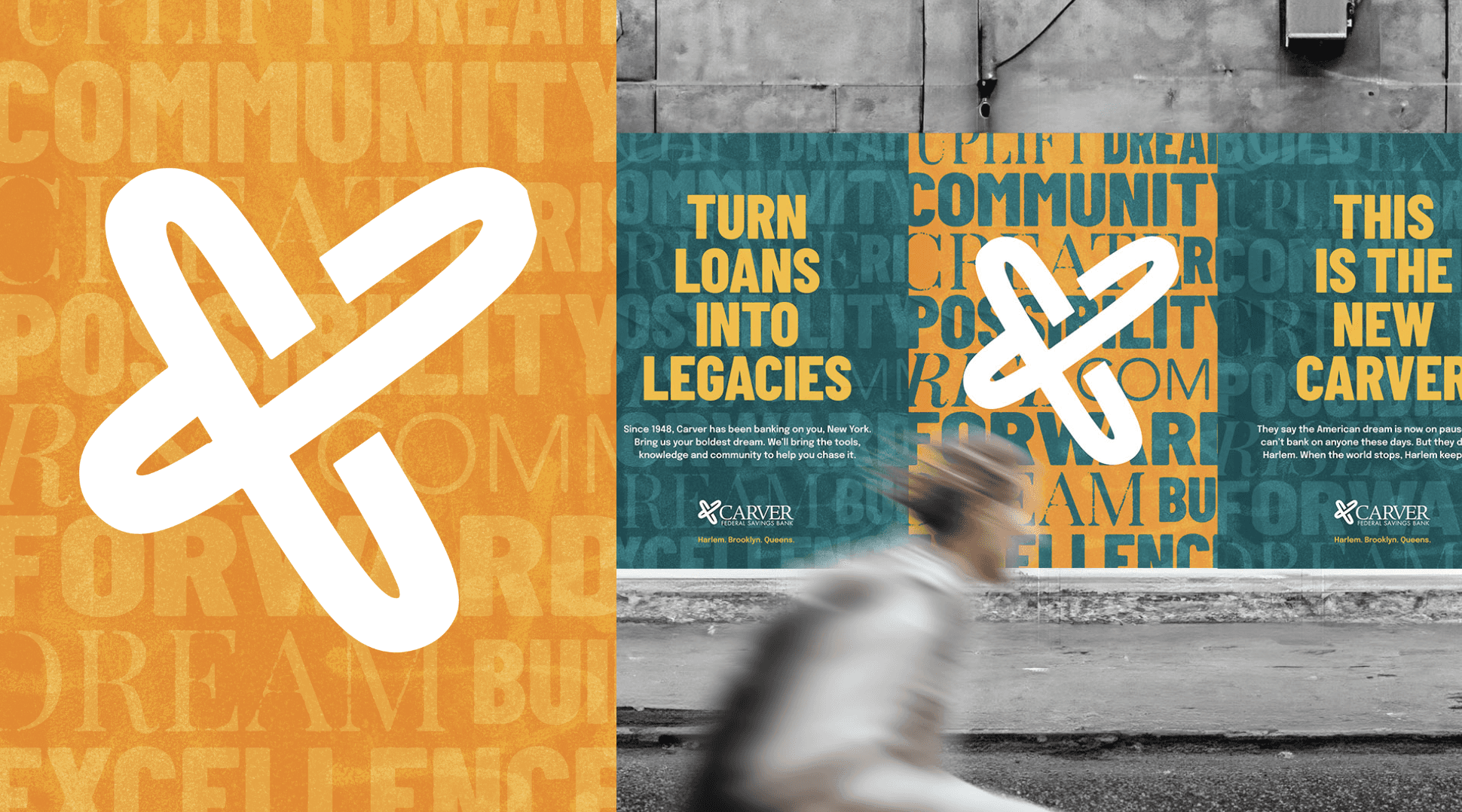
More color. More energy. Still Carver.
Again, we didn’t wipe away the brand’s history. We examined its most recognizable elements and amplified them.
Carver’s signature teal became the foundation, with its secondary gold as another starting point. More saturation. More boldness. More contrast. More energy. We added a new shade of blue to open up the palette and give the system more range.
We gave the colors names that connected them to a bigger story. Legacy Green carries the bank’s history forward. Taxi Gold brings the movement and unmistakable energy of New York. Liberty Blue adds a sense of openness and possibility. Together, they connect where Carver comes from with where its customers want to go.
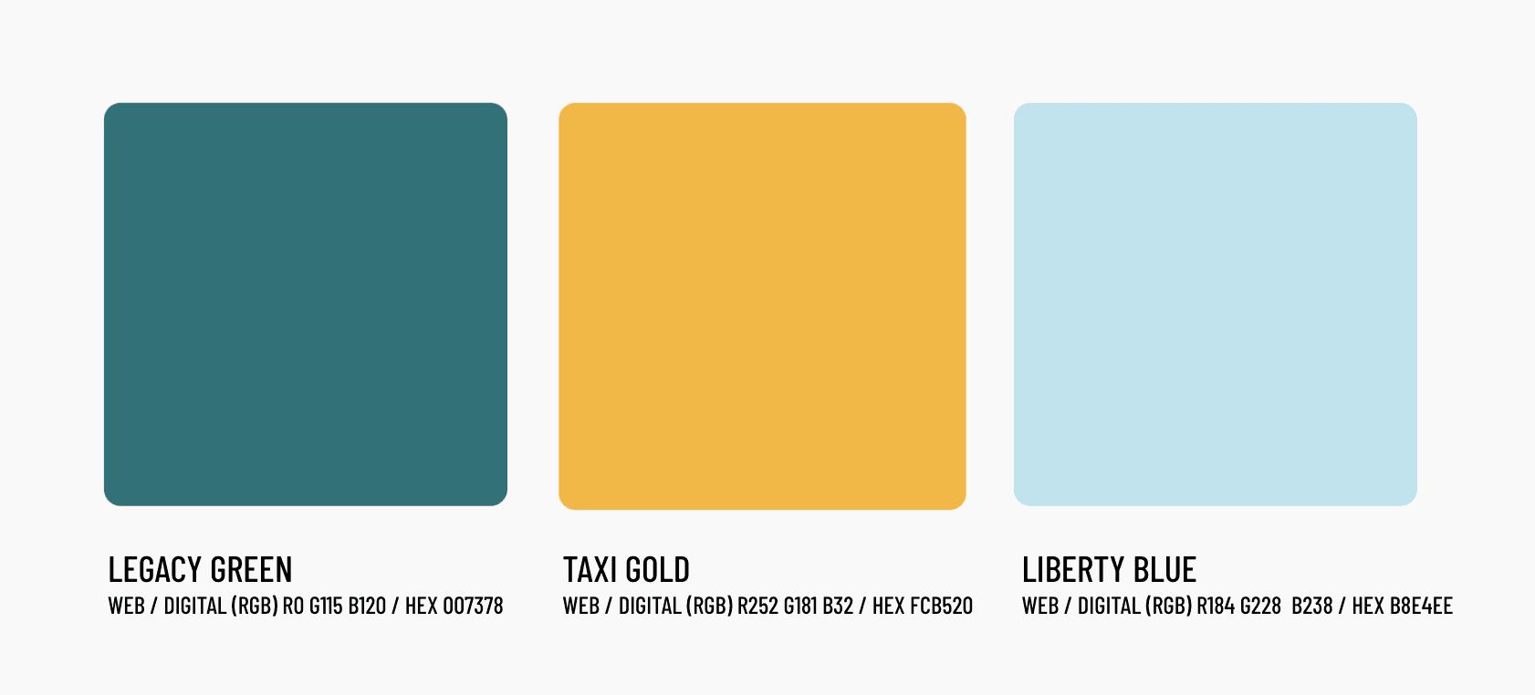
Color was never intended to be monotone for Carver. We envisioned something layered, vibrant, and diverse. Meaningful phrases became typographic backgrounds. Actual street found textures from the boroughs gave the work a physical connection to the places it represents.
We also created a distinct colorway for each of the three communities Carver serves: Harlem, Brooklyn, and Queens. One brand, with room for each place to have its own character.
You can see that in the hand printed risograph posters we produced at Rathaus Press. We distributed them to staff and customers and hung them throughout the city. These were things people could take home, not just look at on a screen.
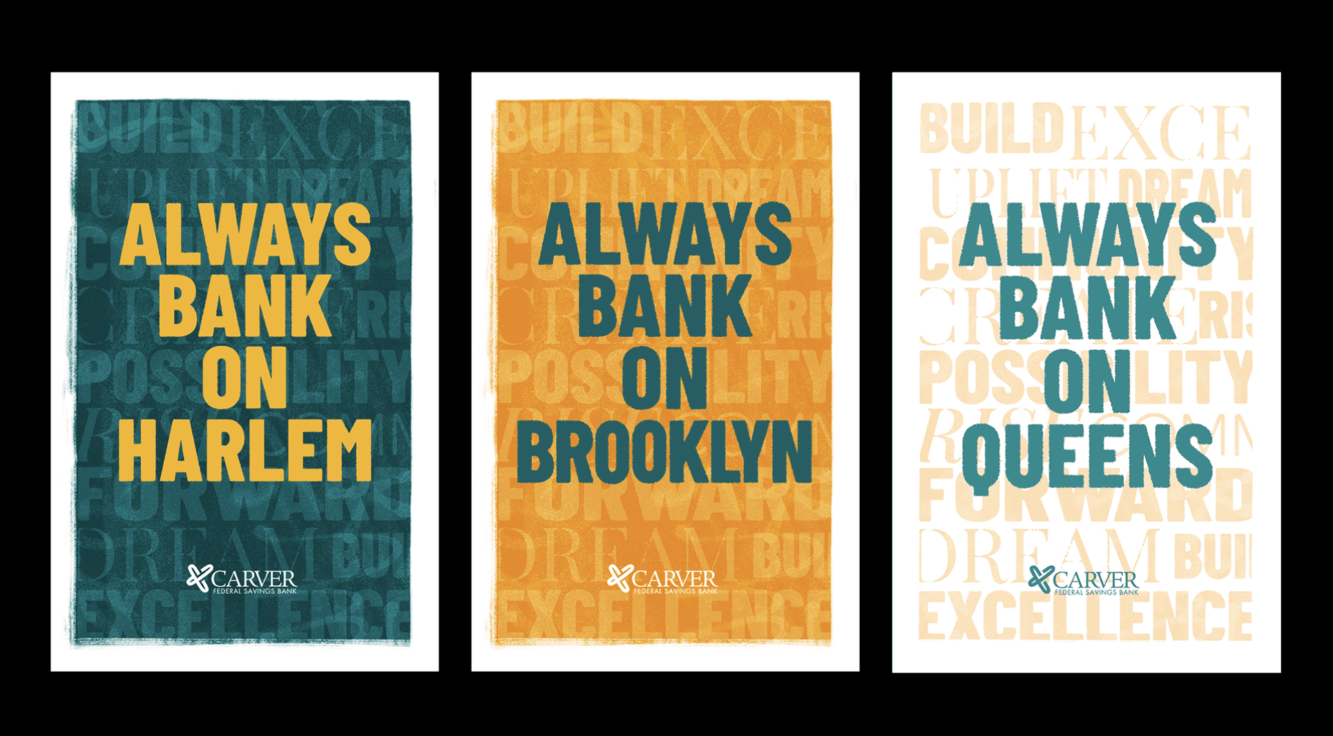

Original risograph test prints at Rathaus Press.
A debit card with a role in the story
Carver already had a debit card. We gave it purpose and narrative.
Think about where a card lives. On your person. In your pocket. In your wallet, next to photos of people you love. It enables you to do things that matter, from the everyday purchase to something you’ve been saving toward.
We named it the Carver Card. Previously, it didn’t have a name or a defined role in the brand story. We wanted it to become an iconic, accessible brand asset. A way for customers to have a daily relationship with the new Carver.
The idea was simple: with this card, you don’t just make a purchase. You make a statement.
As we wrote for the website: “It keeps your money moving and tells the world you bank with New York’s community bank. That’s a power move in your wallet.”
We made the card a visual character in the brand film and social content, showing it being used in the world. The line brought it together:
Your money, at the speed of you.


A branch that meets you with optimism
At Carver’s 125th Street flagship branch, we wanted the new identity to be impossible to ignore.
We designed a massive mural for the most visible wall, bringing together the campaign’s colors, textures, and messages: Always Bank on Harlem. Dream Forward. Turn Money Into Momentum.
This is what you see when you walk into your branch to cash a check. Or do something big, like take out a loan, grow your business, or finance a dream.
Those moments deserve more than a cold corporate environment. We wanted to bring optimism, swagger, and energy to them. A space that makes you feel like your bank believes in you.

A website refresh that knew its job
A complete redesign of a bank’s website is a tall task. There are a lot of complexities beneath the surface, and we didn’t have the time or budget to rebuild everything.
So we made a strategic decision: refresh the main visual identity and messaging, bringing the website into the new brand without taking on a full platform overhaul.
We focused on ease of use, accessibility, and clear messaging. The colors, imagery, and language needed to feel connected to the card in your wallet and the branch down the street.
We think it got the job done, efficiently. And the feedback so far has been great.

Street level thinking meets world class craft
A brand isn’t only the campaign people see. It’s the things they use, carry, keep, and walk into.
For Carver, every surface was an opportunity to make the bank feel more connected to the people it serves. Sometimes that meant a subtle refinement. Sometimes it meant an entire wall.
Street level thinking keeps us close to what matters to people. World class craft is how we make that care visible.
Mike Chatfield is an award-winning Creative Director, Brand Strategist and Marketing Professor with 20 years of advertising experience developing breakthrough ideas and strategies for global brands. He is cofounder and Chief Creative Officer of MIJO, an independent creative agency in New York City specializing in street-level thinking and world-class craft. Connect with Mike on LinkedIn or .
" height="125px" id="d9D7Wg_0X" transform="translate(3.5 3)" width="452.99998308421186px"/></svg>)
← All articles